Why food photography is harder than it looks
Three things go wrong. Appetite: color is everything for food, and a warm kitchen bulb or a green fridge light makes fresh look tired and a vibrant snack look muddy. Reflections: foil wrappers, glossy pouches and glass jars mirror the room and your hand. Trust: buyers read the label and the nutrition panel, and soft focus there makes them hesitate. Fix the color and the background and the same product suddenly looks fresh and legit.

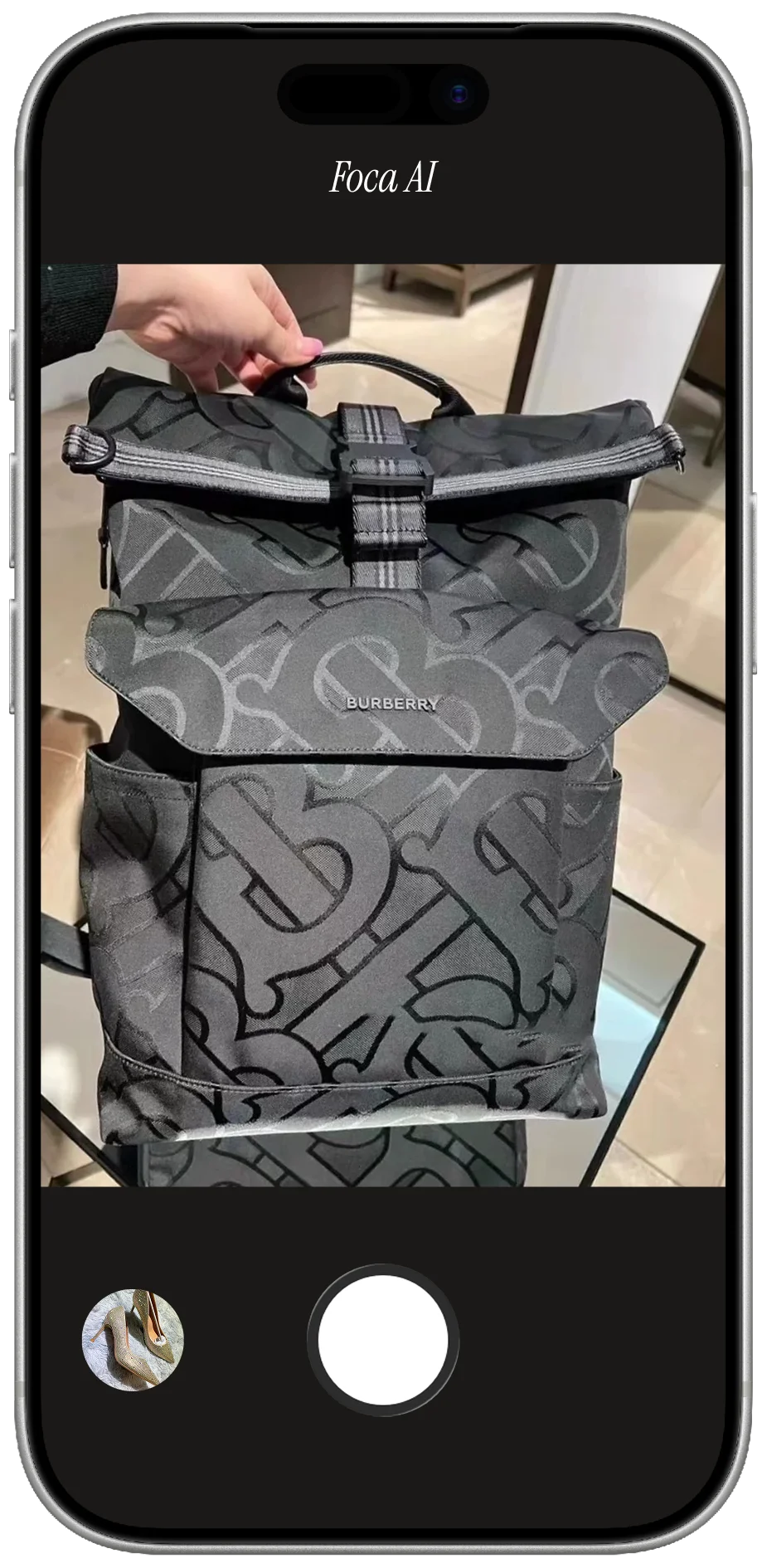
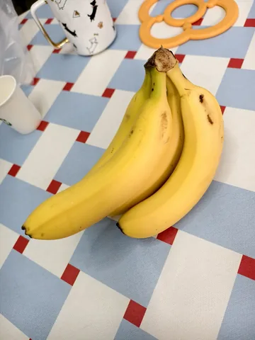
PHONE SHOT
- Shot on a counter — no white background, fails Amazon's main-image rule
- Warm room light dulls the color — fresh starts to look stale
- Cluttered backdrop and shadows pull the eye off the product
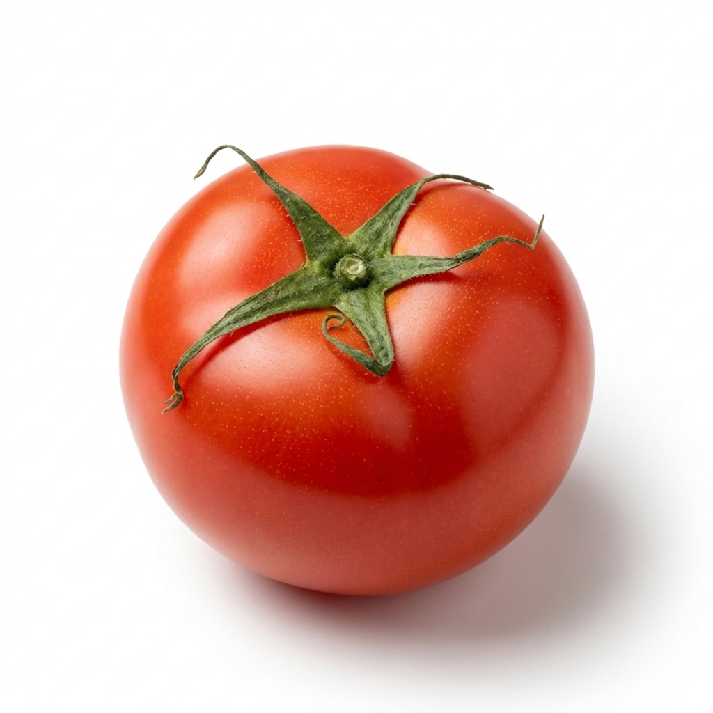
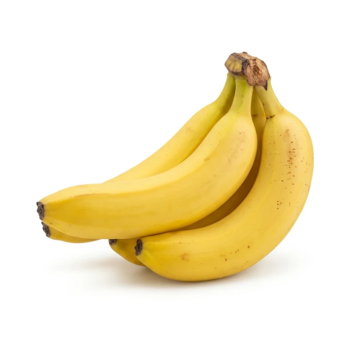
FOCA AI
- Pure RGB 255 white, product centered and filling the frame — listing-ready
- Color corrected to look vibrant and fresh, the way it really is
- Clean edges and a soft shadow so it sits, not floats
Make it look fresh & true
Set white balance off a grey card or plain white paper, and never trust auto under warm or fluorescent bulbs — that's the single biggest fix for food color. Use soft, even daylight (a big window with a sheer, or diffused 5500K LEDs) so there are no harsh shadows and no blown-out highlight on glossy packaging. For fresh produce, shoot it at its peak and a little cool rather than warm — over-warm reads as old. Keep the surface and backdrop neutral so nothing tints the food, then clean to white afterward.
 PHONE SHOT
 FOCA AI
Quick fixes by product type
- Boxes & cartons: a slight three-quarter shows two faces; square the front and keep the type crisp and straight.
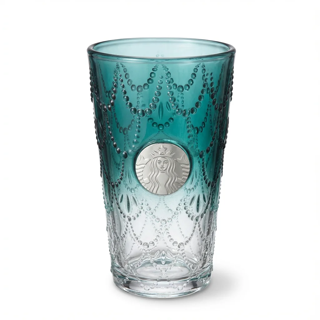
- Jars & glass: light the background separately so glass stays bright and the contents read; mind the lid hotspot.
- Bottles & drinks: straight-on at label height; for clear drinks, a clean backlight keeps the liquid color true.
- Pouches & bags: fill or prop so they stand without slumping; diffuse hard to stop the glossy film from glaring.
- Cans & tins: rotate so the brand faces front and the curved label isn't lost; tame the metallic highlight.
- Fresh produce: shoot at peak, cool not warm; a light mist can add life, but don't let drops blow out as hotspots.
Restaurant menus & delivery apps
If you run a restaurant, café or cloud kitchen, your menu is a photo gallery now — on the printed menu and table tents, on Google Business, and above all on delivery apps like DoorDash, Uber Eats, Grubhub, Meituan and Ele.me. And a dull dish photo on a delivery app costs orders directly: those apps even report that listings with good photos sell noticeably more. The trouble is the shot is usually grabbed at the pass under warm restaurant light, on a busy counter, in a rush — so the food looks yellow and flat, the table is cluttered, and the dishes don't match each other.
The fix is the same as packaged goods: correct the color so the dish looks fresh and true, then drop it on a clean, consistent background so every item on the menu looks like a set. Foca takes the phone photo your kitchen already shot and returns an appetizing, color-true dish on a clean background — run the whole menu in an afternoon, and re-do it in minutes whenever you add a special. Keep it honest, though: the photo should still show the dish the way it's actually served.
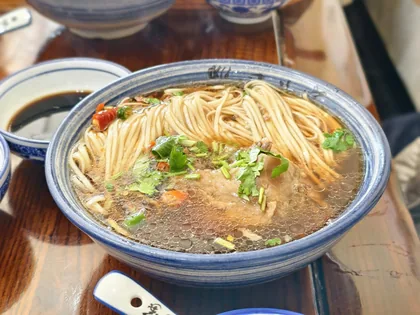 PHONE SHOT
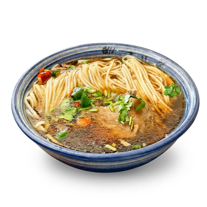 FOCA AI
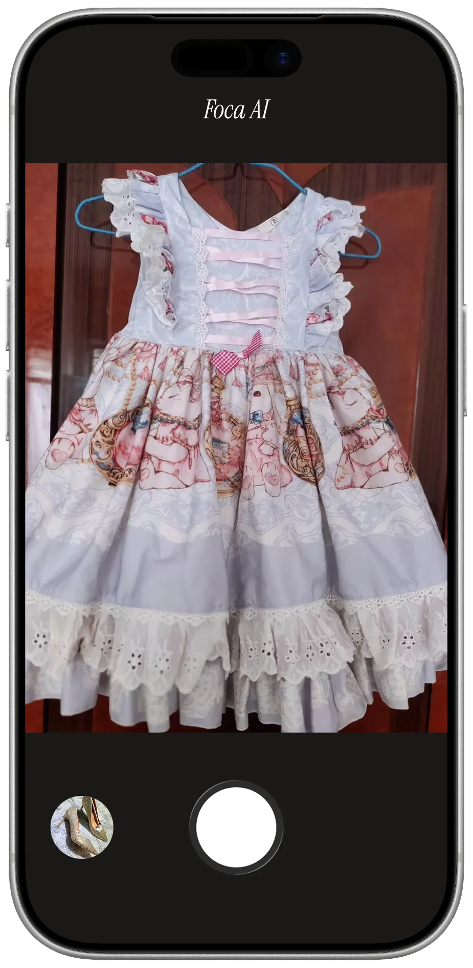
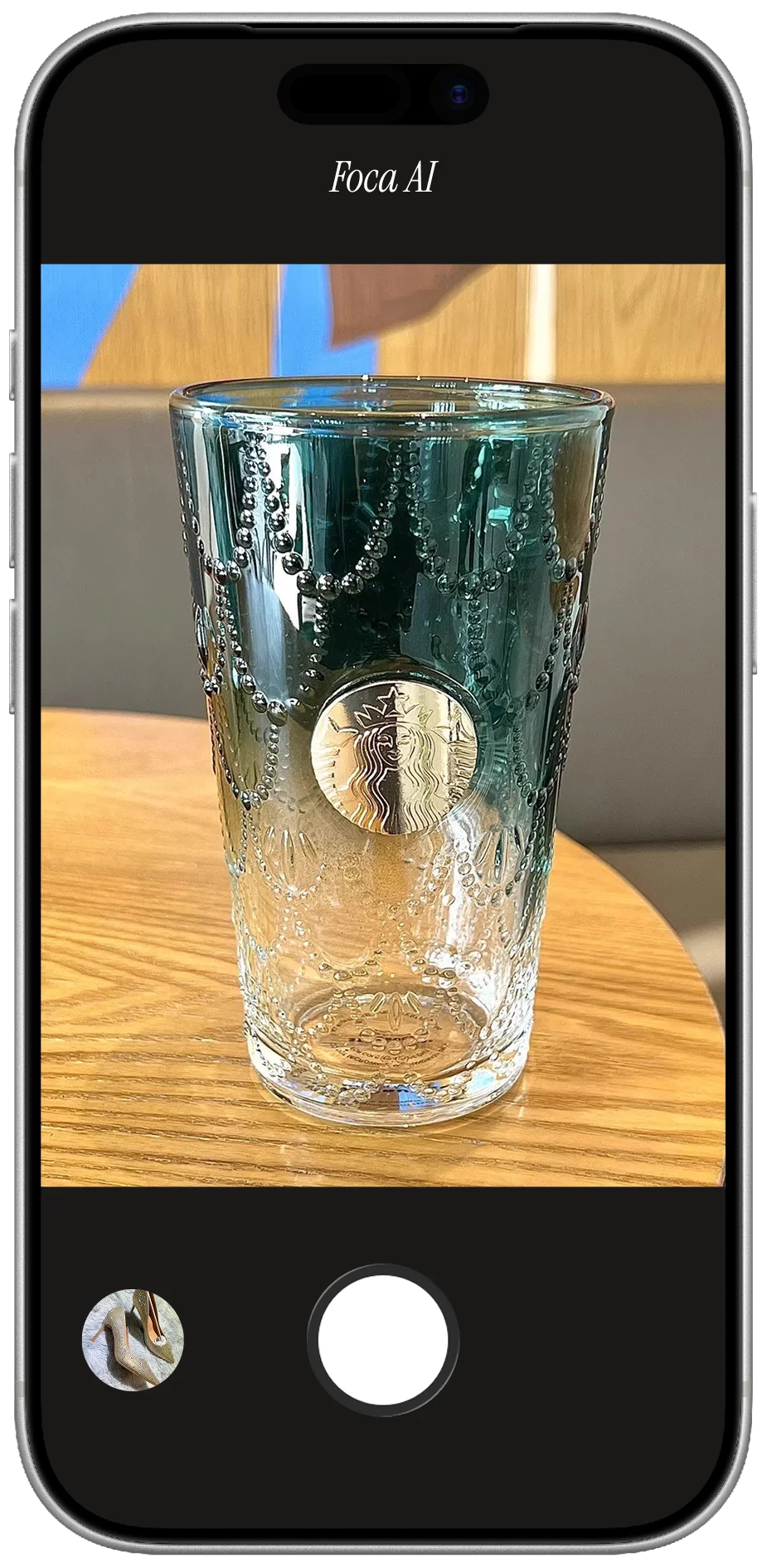
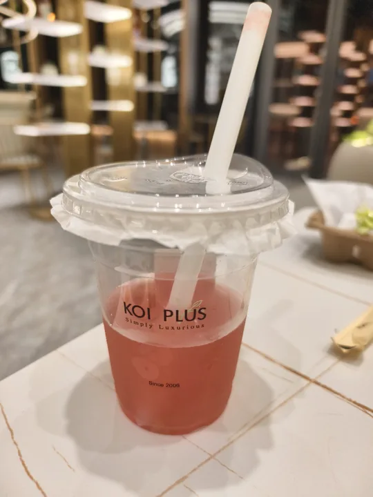
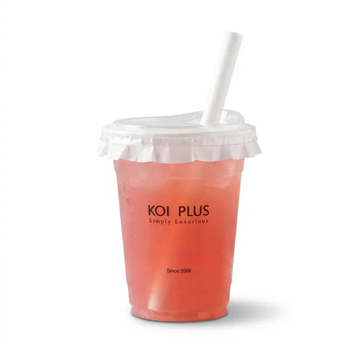
Coffee, bubble tea & journal check-ins
Not every food photo is for a store. A whole community documents what they drink — bubble tea and coffee "check-ins" for Instagram and 小红书, and 手账 (journal / scrapbook) pages where a pretty cut-out of today's cup sits next to the date. The catch is the same one sellers hit: the café table is cluttered, the light is moody, and the cup gets lost in the scene. Drop the photo into Foca and you get a clean cut-out of just the cup on white — perfect to layer into a journal spread, a collage or a sticker, or to post as a tidy check-in. The brand on the cup and the drink's color stay true, so your latte still looks like your latte.
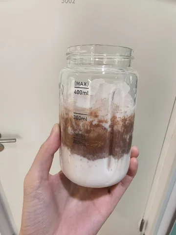 PHONE SHOT
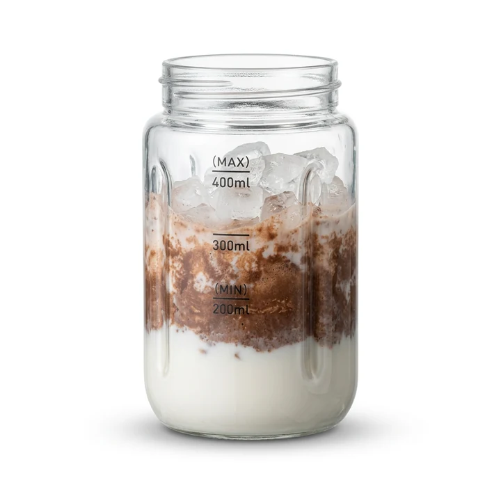 FOCA AI
 PHONE SHOT
 FOCA AI